
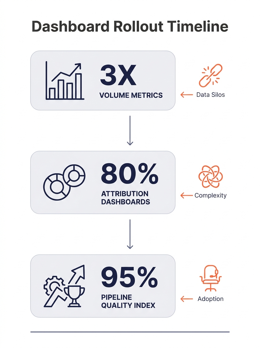
A quality-first outsourced marketing dashboard scores pipeline through a weighted index: opportunity quality (30%), data integrity (30%), and conversion performance (40%). The model requires a phased rollout over 10+ months because 40% of dashboard implementations fail on upstream data problems before surfacing a single useful metric.
The 47-Metric Spreadsheet Nobody Trusted
A mid-market US SaaS company running outsourced PPC management and SEO content through a six-person Philippine team started where most companies start: a Google Sheet with 47 columns tracking every possible output metric. Content pieces published per week. Emails sent. Ad impressions. Cost-per-click. Social shares. Blog traffic by URL. The sheet updated every Monday morning, Philippine time, which meant it landed in US inboxes Sunday night.
The problem wasn’t the metrics themselves. Each one measured something real. The problem was that none of them answered the question the VP of Sales actually cared about: which marketing channels produced deals that closed, and at what cost?
According to HockeyStack’s attribution dashboard guide, effective setups include “month-to-date and month-on-month performance reports that show metrics such as ad spend, Sales Qualified Leads (SQLs), pipeline, and revenue in real time.” That prescription assumes a single-location team with shared CRM access and aligned reporting cadences. When your dedicated social media team operates in Manila and your sales team logs pipeline updates in Chicago, the “real time” part breaks down fast.
The volume dashboard phase (months 1 through 3 in most phased rollouts) does serve a purpose. It builds operational trust. You confirm that the offshore team is producing output at the expected cadence: 12 blog posts per month, $8,400 in managed ad spend, 3 landing page tests per sprint. As a framework for measuring distributed team performance, volume tracking works fine. As a framework for marketing ops outsourcing decisions, it tells you almost nothing about revenue.
Common KPIs during this phase include lead generation count, conversion rate, customer satisfaction scores, cost per lead, and return on investment, according to a LinkedIn guide on marketing operations outsourcing KPIs. But cost per lead without deal-stage weighting is a vanity metric. A $12 lead that never converts past MQL is more expensive than a $85 lead that closes in 30 days.
Multi-Touch Attribution Gets Bolted On
Why does the attribution layer take four to eight weeks to implement? Because stitching multi-touch attribution tracking across an outsourced marketing operation requires solving three problems simultaneously: UTM taxonomy enforcement, CRM field mapping, and cross-timezone data freshness.
Multi-touch attribution software tracks every touchpoint in a customer’s journey and distributes conversion credit across them using a mathematical model, as SegmentStream’s 2026 tool comparison describes. Tools like Northbeam MTA, LeadsRx, and Cometly each handle this differently. Northbeam focuses on advertising spend analysis across channels. LeadsRx integrates both online and offline data through a single tracking pixel. Cometly emphasizes real-time spend-to-revenue connections.
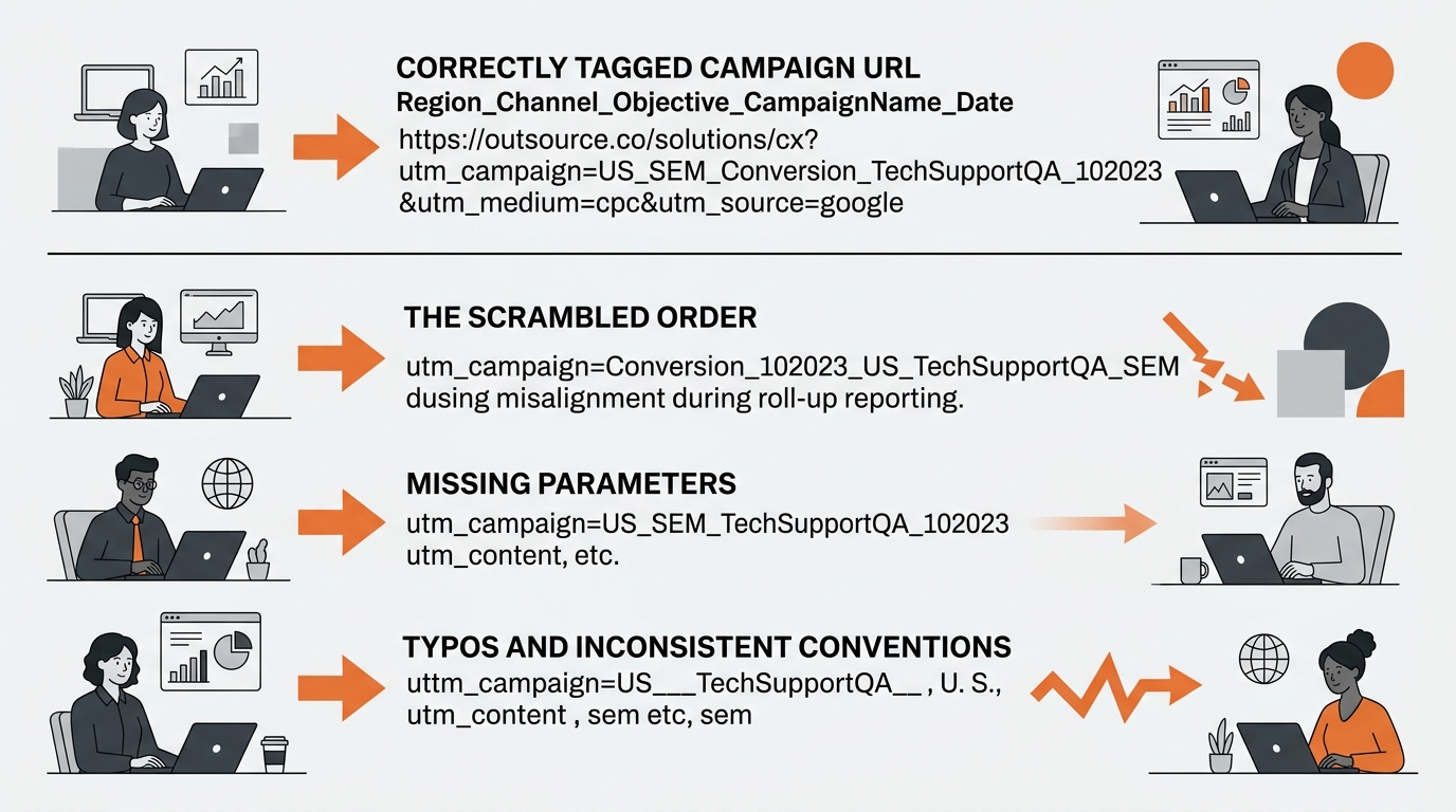
The SaaS company in question chose HockeyStack, partly because its dashboard architecture already supported the month-to-date and month-on-month views they wanted. But the tool only works when every campaign, ad group, and content asset follows a strict naming convention. The format they adopted was Region_Channel_Objective_CampaignName_Date, which meant the Philippine team had to tag every Google Ads campaign, every Facebook ad set, and every SEO content brief with exactly the right string. One misspelled region code or a missing date suffix, and that touchpoint vanished from attribution reports.
This is where distributed team performance measurement gets uncomfortable. The Philippine team’s accuracy rate on UTM tagging hit 74% in the first month of the attribution phase. Twenty-six percent of campaign touchpoints were either untagged, mistagged, or tagged with deprecated conventions. Pipeline quality metrics calculated from that data were unreliable. The VP of Sales, who had asked for better data, got worse data for three weeks while the tagging errors were cleaned up.
Warning: Data quality failures at the attribution layer are the single most common reason outsourced marketing dashboard projects stall. Enforce naming conventions with automated validation before moving to PQI scoring.
Thinkit Media’s guidance on marketing operations outsourcing recommends demanding “a clear onboarding plan, documented standard operating procedures, and knowledge-transfer milestones.” In this case, the SOP for UTM tagging existed but had never been pressure-tested against real campaign volume. The team was producing 40+ tagged assets per week. At that pace, a 74% accuracy rate meant roughly 10 ghost touchpoints per week that attribution models couldn’t resolve.
The PQI Score and Its First Real Test
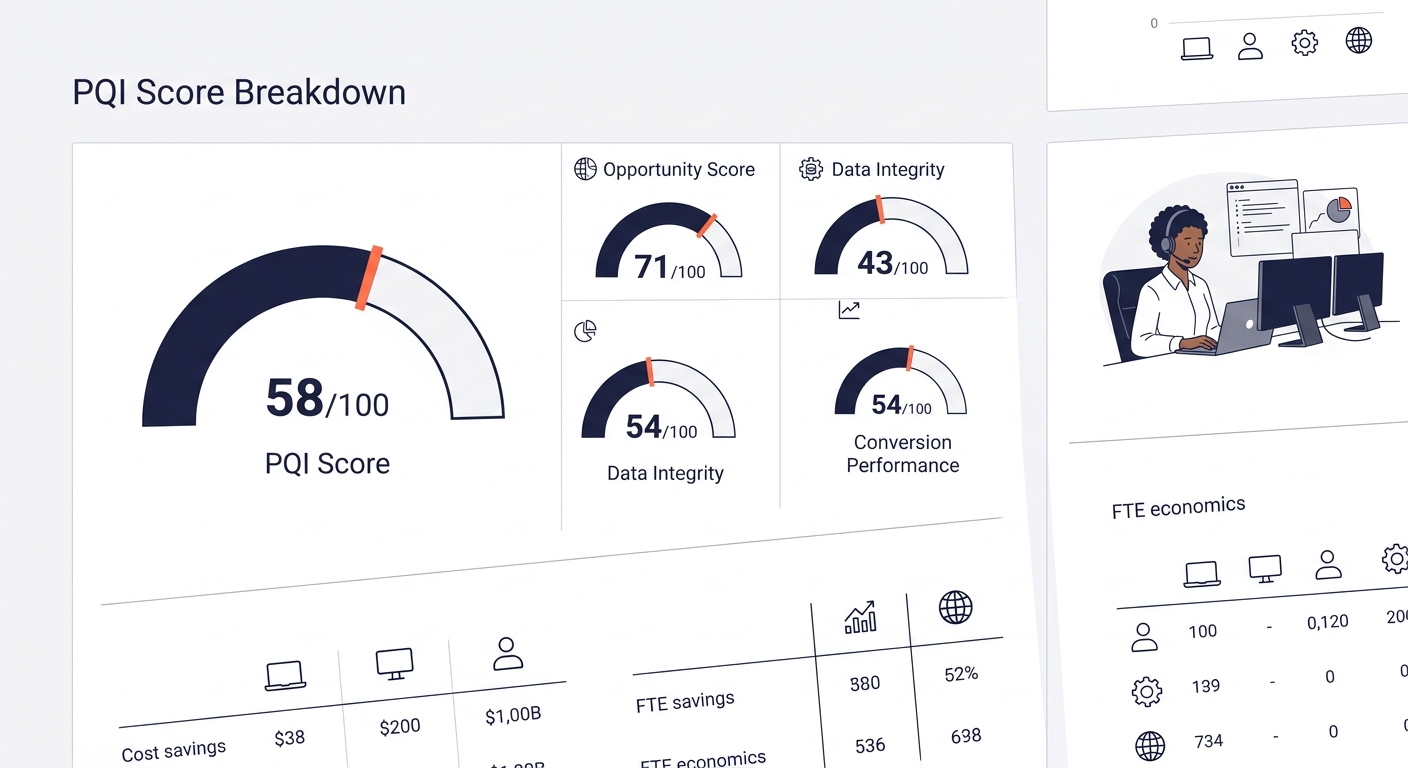
The Pipeline Quality Index formula went live in month 11: PQI = (Opportunity Score × 0.3) + (Data Integrity × 0.3) + (Conversion Performance × 0.4). Each component pulls from a different data source. Opportunity Score comes from CRM deal-stage data, weighted by close probability. Data Integrity measures UTM accuracy, CRM field completeness, and duplicate contact rates. Conversion Performance tracks the ratio of marketing-sourced pipeline that advances past SQL to closed-won.
The first PQI report showed a composite score of 58 out of 100. Broken down: Opportunity Score sat at 71 (sales teams were updating deal stages reasonably well), Data Integrity scored 43 (UTM accuracy had improved to 86% but CRM field completeness lagged at 62%), and Conversion Performance landed at 54 (marketing-sourced pipeline was converting to closed-won at 11.2%, versus a target of 18%).
A $12 lead that never converts past MQL is more expensive than an $85 lead that closes in 30 days. Pipeline quality scoring makes that math visible.
That 43 on Data Integrity forced the team to confront something dashboards alone can’t fix. As one analysis on DEV Community put it, teams should “audit your most important pipeline. Add a validation stage with checks for completeness, uniqueness, and volume. Route failures to a quarantine table. Within a week, you’ll know more about your data quality than any dashboard could tell you.” The outsourced marketing dashboard wasn’t the problem. The data pipeline feeding it was the problem.
Successful ABM programs that implement PQI-style scoring report 25-40% of total pipeline originating from target accounts and 15-25% shorter sales cycles compared to volume-only measurement. Those numbers only hold when the data foundation is clean. The SaaS company’s 62% CRM field completeness rate meant roughly 38% of pipeline data was either missing contact source, deal value, or expected close date.
The fix required 12 hours of monthly maintenance: 4 hours for the Philippine marketing team to run data audits, 3 hours for the US sales ops analyst to reconcile CRM records, and 5 hours for joint review calls addressing pipeline discrepancies. That 12-hour monthly cost is real. But the alternative was making quarterly budget decisions based on a 47-column spreadsheet that answered zero revenue questions.
The Data Foundation Under Everything
Core metrics like throughput, latency, error rate, and freshness are critical for maintaining pipeline health, according to RudderStack’s monitoring guide. Most marketing teams think about dashboards as the visualization layer. They pick a BI tool, connect data sources, and build charts. The teams that succeed think about the pipeline underneath.
For this implementation, the data pipeline had four components: ad platforms (Google Ads, Meta Ads Manager) as the source of truth for spend and impressions; the CRM (HubSpot) as the source of truth for pipeline and revenue; UTM parameters as the bridge between the two; and the attribution platform (HockeyStack) as the calculation engine. Each component had its own error rate. Google Ads data refreshed every 3 hours. HubSpot deal stages updated whenever a sales rep remembered to update them, which averaged every 2.8 days. UTM data was real-time but only as accurate as the tagging discipline.
The recommended practice from Prefect’s pipeline monitoring guide is to “ship logs and metrics to a single location for your entire end-to-end data pipeline” and “use some method, such as a uniquely generated UUID, to tag a run so you can trace it throughout all the components of your architecture.” The SaaS company adapted this by assigning each campaign a Campaign ID at creation that persisted across Google Ads, HubSpot, and HockeyStack. When attribution models showed a gap, the Campaign ID let them trace exactly where the data broke.
| Dashboard Type | Setup Time | CRM Integration Depth | Primary Metric | Risk of Gaming |
|---|---|---|---|---|
| Volume | 1-2 weeks | Minimal | Cost-per-lead | High |
| Attribution | 4-8 weeks | Deep (multi-touch) | Revenue per channel | Medium |
| PQI | 6-12 weeks | Full (deal stage + data integrity) | Weighted pipeline score | Low |
The volume dashboard took 9 days to build. The attribution layer required 6 weeks. PQI scoring took another 11 weeks on top of that. Total elapsed time from first spreadsheet to functioning pipeline quality metrics: roughly 13 months. Companies that try to skip directly to PQI scoring, bypassing the volume and attribution phases, hit the 40% failure rate cited earlier. The phased approach, documented in the pipeline quality dashboard comparison published on this site, exists because each phase surfaces and resolves a specific category of data problem.
What the PQI Score Changed About How This Team Operates
The composite PQI score hit 74 by month 14. Data Integrity climbed from 43 to 68 after automated UTM validation scripts caught tagging errors before campaigns went live. CRM field completeness improved to 81% after the US sales team started getting weekly reports showing which deals were missing data. Conversion Performance moved from 54 to 71 as the Philippine marketing team shifted budget away from two channels that generated high lead volume but single-digit close rates.
The shift in team behavior mattered more than the score itself. Before PQI, the outsourced team optimized for the metrics they were measured on: content output, ad spend efficiency, lead volume. Those are the metrics most outsourced marketing KPI frameworks recommend. They’re useful. They’re also insufficient for answering whether marketing spend is generating revenue.
After PQI, the weekly standup between the Philippine team and the US marketing director stopped being a reporting call and started being a diagnostic call. Instead of “we published 14 blog posts and generated 312 MQLs,” the conversation became “our PQI dropped 3 points because Data Integrity fell after the new Google Ads campaign structure launched without Campaign IDs.” That specificity changes how distributed teams coordinate across time zones. It gives the offshore team a shared language with the revenue side of the business.
The 47-metric spreadsheet still exists in a Google Drive folder somewhere. Nobody has opened it since month 12. The outsourced marketing dashboard that replaced it has 11 metrics on the front page, a PQI trend line, and three drill-down views. It takes the Philippine team about 45 minutes per week to maintain. And for the first time since the company started outsourcing marketing execution, the VP of Sales trusts the numbers enough to reference them in board meetings.